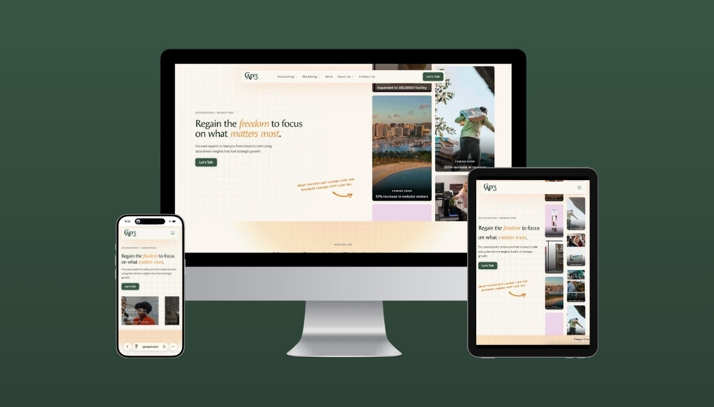
5 Ways Mobile-Friendly Website Design Gives You a Competitive Edge
In this article:
A little over half of all website traffic comes from mobile devices like phones and tablets.
That’s an interesting statistic, but it doesn’t tell the whole story.
Add to that the fact that 88% of users won’t return to a website if they have a bad user experience (UX), and you get a better grasp of the complete picture. So, if you don’t have a mobile-friendly website design, you’re not providing a quality experience for more than half of your visitors.
Therefore, that half is very unlikely to return to your website, whether that’s to purchase the latest product or to schedule an appointment.
Mobile-friendly web design makes all the difference.
So is your website built for all visitors, or are you pushing away valuable traffic, missing opportunities?
At CAP3 | Proclaim, we understand that a good UX is critical to making conversions that drive your growth. That’s why we specialize in converting website visitors into customers. We take the helm of the marketing work, so you can concentrate on running your business or seeing patients. Through multifaceted campaigns and detailed strategic insights, we provide you with the clarity that allows the freedom to lead. Want to know more? Just contact us.
In this blog, we’ll take a look at five ways mobile-friendly website design can help you. But first, let’s examine what makes a website mobile-friendly.
What Makes a Website Design Mobile-Friendly?
A website that is mobile-friendly demonstrates good UX through design that was meant to be consumed on a phone or tablet. Following are some elements that make a design mobile-friendly:
- It’s easy to read. Pinching and scrolling in order to see the complete content is annoying and awkward, contributing to a bad user experience. By contrast, a mobile-friendly website promotes a positive reading experience.
- It’s easy to navigate. Simple, straightforward navigation enables the user to easily find the information they need, and prompts them to stay on the website longer.
- It’s faster. Did you know that 53% of users won’t wait longer than three seconds for a site to load? Therefore, it’s not only crucial to put your best foot forward, but to do so in an immediate manner. A site that is specifically designed for mobile UX provides the speed and reliability users desire.
What Are the Benefits of a Mobile-Friendly Website Design?
There are several benefits of mobile-friendly website design. They include:
1. It Ranks Better on Google
Google utilizes mobile-first indexing. This means that Google will use the mobile version of a website when indexing and determining how to rank your site. When Google indexes a site, it means Google has crawled it and included it in its search engine results. A poor mobile experience can tank your Google rankings.
2. It Leads to Better Conversions
A site that is hard to navigate is often abandoned. Good mobile UX is about making it easier for the user to make a purchase or take a certain action. This positive experience builds trust and reduces friction in the process. Click-to-call buttons, forms that are easy to fill and simplified checkouts are all examples of a smooth mobile experience.
3. It Enhances Your Brand
A polished, professional mobile experience signals quality at a glance, and this quality builds the kind of trust that turns visitors into clients.
Your website is your brand, and a good mobile design affects perception.
4. It Keeps Pace With Mobile Usage
Roughly 16% of American adults are classified as “smartphone – only” internet users. This means that they do not subscribe to a home broadband service, and they only access the internet through their phones.
Mobile devices (not including tablets) accounted for over half (58%) of website traffic in 2023…and that number continues to grow.
Mobile-friendly design keeps you aligned with where your audience is headed. It also ensures you’re not handing business to competitors who are already there.
5. It Reaches Clients When They’re Ready to Make A Decision
Most of the “near me” searches –such as “primary care doctors near me”–happen on mobile devices. Those users are looking for a solution…immediately. These searchers also have “high purchase intent,” meaning they’re ready to make a decision, schedule an appointment or make a purchase.
Is It Possible to Make an Old Website Mobile-Friendly?
Yes, it’s possible. In fact, we’ve done it for many clients. However, we’ve often discovered that our clients benefit more from having a complete refresh of their website. (We’ve even won awards for the refreshes we’ve done.)
Not sure how mobile-friendly your website is? Just contact us, and we’ll be glad to review your website and give you practical information on how we can help you.
Let CAP3 | Proclaim Build a Mobile-Friendly Website That Attracts and Converts Clients
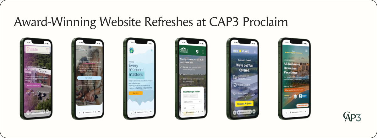
Do you want to sell more products? Do you need to expand your medical practice and you’re looking for more patients?
Mobile-friendly website design is crucial to making that happen.
We understand that good user experience begins with clarity: Clarity in design, in messaging and in branding. Let us provide the marketing expertise you need so you can concentrate on leading and growing your business or medical practice. Contact us today.
Key Takeaways
- Over half of all website traffic comes from mobile devices, making mobile-friendly design essential for reaching your audience.
- 88% of users won’t return after a bad experience, so poor mobile design directly costs you repeat visitors and conversions.
- Google’s mobile-first indexing means a weak mobile experience can significantly hurt your search rankings.
- Smooth mobile UX — including easy navigation, fast load times, and simple forms — directly increases conversions and builds brand trust.
- Roughly 16% of American adults use smartphones as their only internet access, making mobile optimization a necessity, not a luxury.
- “Near me” mobile searches carry high purchase intent, meaning a mobile-friendly site captures users who are ready to act immediately.
- Outdated websites can be made mobile-friendly, though a full redesign often delivers better results.
=====
Sources:
Forbes, “Top Website Statistics For 2025,” https://www.forbes.com/advisor/business/software/website-statistics/
Indeed, “4 Characteristics of a Mobile-Friendly Website (With Tips)” https://www.indeed.com/career-advice/career-development/mobile-friendly
Pew Research Center, “Mobile Fact Sheet,” https://www.pewresearch.org/internet/fact-sheet/mobile/#who-is-smartphone-dependent
Shopify, “What Is Mobile Website Design? 7 Mobile Design Tips” https://www.shopify.com/blog/mobile-website
Statista, “Share of Website Traffic Coming From Mobile Devices,” https://www.statista.com/statistics/277125/share-of-website-traffic-coming-from-mobile-devices/#:~:text=Mobile%20accounts%20for%20approximately%20half,permanently%20surpassing%20it%20in%202020.